📊 Nonlinear Beta
Traditional beta assumes that an asset's sensitivity to market movements is the same in both bullish and bearish markets. But what if this assumption is wrong? Enter nonlinear beta - the idea that assets may respond differently to market gains versus market losses.
🎯 The Core Concept
In traditional CAPM, beta is calculated as:
This gives us a single beta value. But what if we split the market into positive and negative return periods?
The ratio \(\frac{\beta^+}{\beta^-}\) tells us about the asymmetry. A ratio > 1 means the asset is more sensitive to market gains, while < 1 means it's more sensitive to market losses.
🔬 My Research
I conducted a comprehensive analysis of the S&P 500 to test for nonlinear beta patterns. Here are the key findings:
Key Results:
- Energy Sector: Shows the most dramatic asymmetry (0.751 ratio) - energy stocks have much higher sensitivity during market downturns
- Industrials Sector: Highest ratio (1.079) indicating higher sensitivity to market gains
- Health Care: Most symmetric sector (1.002 ratio)
- Statistical Significance: Energy, Information Technology, Real Estate, and Materials sectors show statistically significant asymmetry
Most Asymmetric Stocks:
Highest Positive Bias (β⁺/β⁻ > 1.4)
- MKTX (MarketAxess): 1.916 ratio - Financials
- ED (Consolidated Edison): 1.915 ratio - Utilities
- ERIE (Erie Indemnity): 1.717 ratio - Financials
- LMT (Lockheed Martin): 1.590 ratio - Industrials
- MOH (Molina Healthcare): 1.559 ratio - Health Care
- CAG (Conagra Brands): 1.519 ratio - Consumer Staples
- KMB (Kimberly-Clark): 1.510 ratio - Consumer Staples
- FAST (Fastenal): 1.488 ratio - Industrials
- CPB (Campbell Soup): 1.486 ratio - Consumer Staples
- EA (Electronic Arts): 1.448 ratio - Communication Services
Highest Negative Bias (β⁺/β⁻ < 0.7)
- CBOE (Cboe Global Markets): 0.358 ratio - Financials
- GE (General Electric): 0.396 ratio - Industrials
- EXE (Enexor Energy): 0.442 ratio - Energy
- KR (Kroger): 0.481 ratio - Consumer Staples
- DLTR (Dollar Tree): 0.545 ratio - Consumer Staples
- ABBV (AbbVie): 0.578 ratio - Health Care
- EQT (EQT Corporation): 0.584 ratio - Energy
- KMI (Kinder Morgan): 0.635 ratio - Energy
- TECH (Bio-Techne): 0.642 ratio - Health Care
- CME (CME Group): 0.649 ratio - Financials
📊 Visualizations
The analysis includes comprehensive visualizations showing beta asymmetry patterns across sectors and individual stocks.
Sector-by-Sector Analysis
Complete S&P 500 sector analysis showing beta ratios for all 11 GICS sectors:
Comprehensive visualization of all 11 sectors with gradient color coding
Features:
- • All 11 GICS sectors in comprehensive view
- • Gradient color scheme (Red → Orange → Yellow → Light Blue → Blue)
- • Value labels showing exact beta ratios
- • Reference line at 1.0 for symmetry
Key Insights:
- • Energy shows dramatic asymmetry (0.751 ratio)
- • Industrials shows highest ratio (1.079)
- • Health Care most symmetric (1.002 ratio)
- • Clear sector-specific patterns
Statistical Analysis
Comprehensive statistical testing and beta comparison analysis:
Sector Comparison with Confidence Intervals
Top Chart: Average positive vs negative betas by sector with 90% confidence intervals
Bottom Chart: Beta ratio comparison across all 11 sectors
Key Finding: Energy (0.751) and Industrials (1.079) show significant asymmetry
Beta Comparison Analysis
Highest Beta Stocks: 20 stocks with highest overall beta values
Lowest Beta Stocks: 20 stocks with lowest overall beta values
Pattern: Most stocks show similar positive and negative betas
Scatter Plot Analysis
Scatter plot showing positive vs negative betas for all 502 companies:
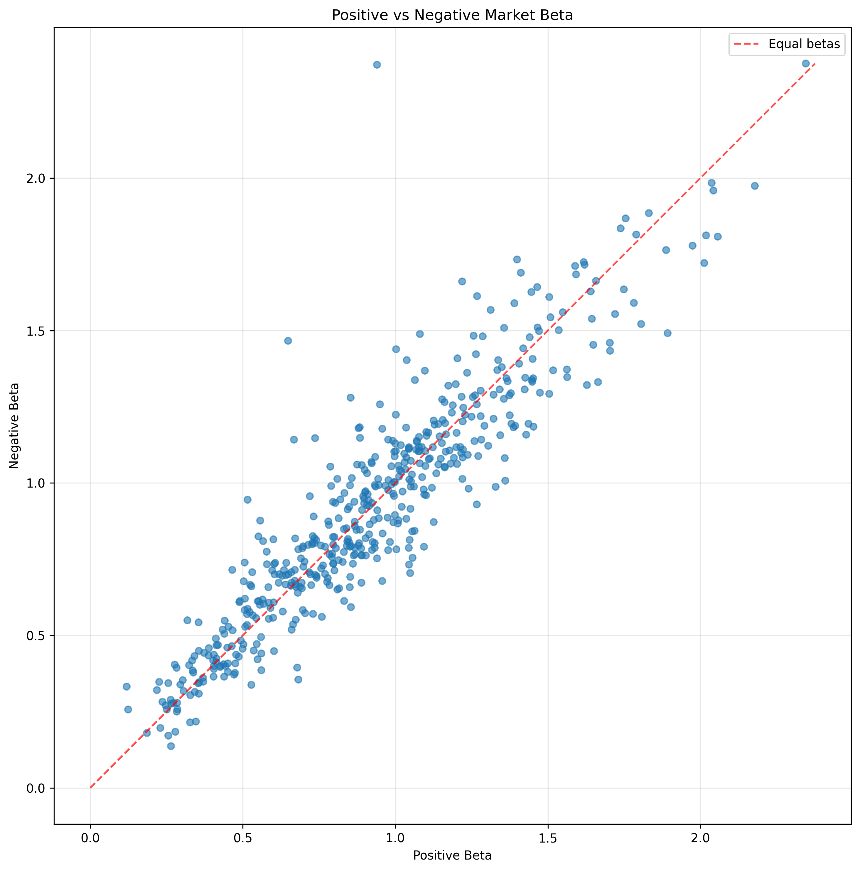
Positive Beta on x-axis, Negative Beta on y-axis with diagonal reference line
Features:
- • All 502 companies plotted
- • Diagonal reference line for equal betas
- • Equal aspect ratio for proper visualization
- • Clustering around diagonal line
Observations:
- • Strong correlation between positive and negative betas
- • Most points cluster around diagonal line
- • Some outliers show significant asymmetry
- • Overall market shows minimal systematic bias
Comprehensive Statistical Analysis
Four-panel analysis showing detailed statistical results:
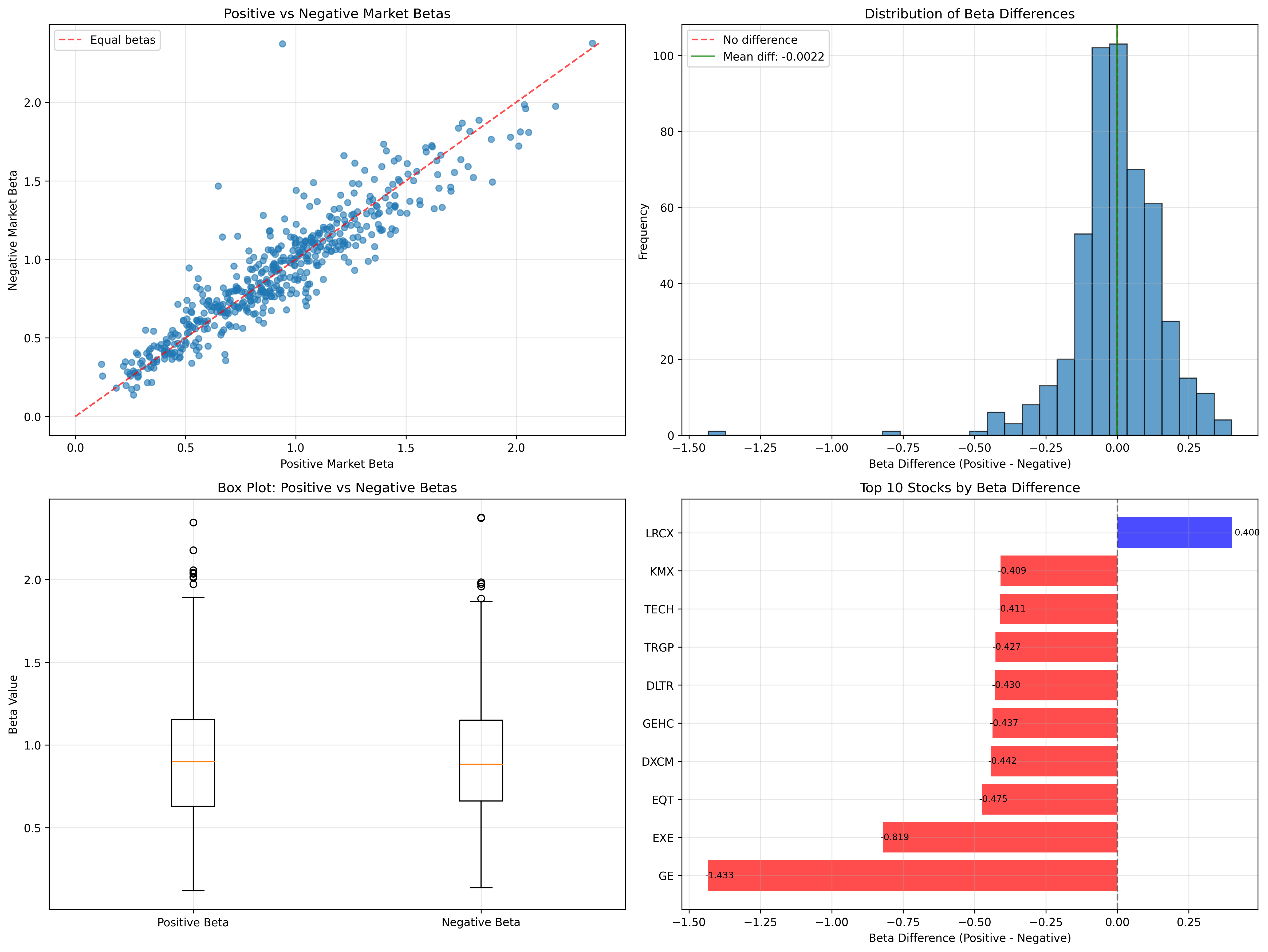
Four-panel analysis: Scatter Plot, Histogram, Box Plot, and Top 10 Stocks
Scatter Plot
Positive vs negative betas with diagonal reference line
Histogram
Distribution of beta differences with mean and zero reference lines
Box Plot
Comparing positive vs negative beta distributions
Top 10 Stocks
Stocks with largest absolute beta differences (blue = positive bias, red = negative bias)
📚 Related Work
This research builds on earlier work by Eran Raviv, who pioneered the concept of nonlinear beta. His foundational paper provides the theoretical framework for understanding asymmetric market relationships.
Reference: Eran Raviv - Non-Linear Beta
💻 Code & Implementation
The complete analysis, including data collection, statistical testing, and visualization, is available in my GitHub repository:
Features: S&P 500 analysis, econometric testing, sector analysis, and comprehensive visualizations
📱 Instagram Video
🎬 Watch my Instagram video on Nonlinear Beta:
🎯 Practical Implications
Portfolio Construction
- • Energy stocks for downside protection
- • Industrials for upside capture
- • Health Care for balanced exposure
Risk Management
- • Dynamic hedging strategies
- • Sector-specific beta awareness
- • Asymmetric risk assessment
🔬 Technical Details
The analysis uses 1,139 trading days (2021-2025) with SPY as the market proxy. Statistical significance is tested using paired t-tests with 90% confidence intervals.
Statistical Results:
- • Sample Size: 502 S&P 500 companies
- • Mean Positive Beta: 0.9171
- • Mean Negative Beta: 0.9193
- • Overall Market: Not statistically significant (p = 0.754)
- • Energy Sector: Strong negative bias (p < 0.05)
- • Information Technology: Positive bias (p < 0.01)
- • Industrials: Highest ratio (1.079)
Note: This research challenges traditional CAPM assumptions and provides insights for more sophisticated portfolio construction and risk management strategies.